
Updated: May 10, 2024
Published: November 29, 2017
Jenkins is one of the most popular software builds automation servers in the industry. It is used by many teams across the world in the continuous integration process. You might be comfortable with periodic checks of the build statuses on the Jenkins server when it has not that many jobs. However, it is much more convenient to get notifications about the builds when everything gets more complex and the number of tasks is growing. It is even better if these notifications are grouped into teams, channels, etc. There are several solutions that offer workplace chat functionality. Microsoft Teams is the most popular among businesses that are already in Microsoft Office 365 ecosystem. In this article, we’ll talk about making the UX design and content of Jenkins notifications more optimized and convenient for the Microsoft Teams users.
CONNECTING JENKINS TO A MICROSOFT TEAMS CHANNEL
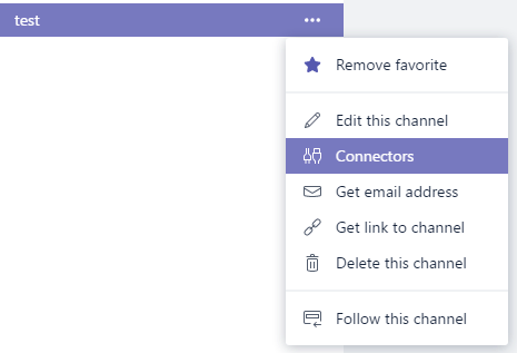
First, you will need to get notification URL in your channel. Click the menu button next to your channel name:
Find the Jenkins and click Configure. Enter the name that describes the channel and click Create. You will see a field called Webhook URL with the URL that starts with “https://outlook.office.com/webhook/”. Save it somewhere as you will need it later.
You will have to install Jenkins plugin to enable your build jobs to post notifications. In order to do this, go to your Jenkins URL and then go to /pluginManager/available and find a plugin called Office 365 Connector. Install it the same way as any other plugins.
Next step is to enable it in your build. You can do in specific build Configuration. Next to the Job Notifications section, you will see Office 365 Connector, click Add webhook button.
This is how it looks like:
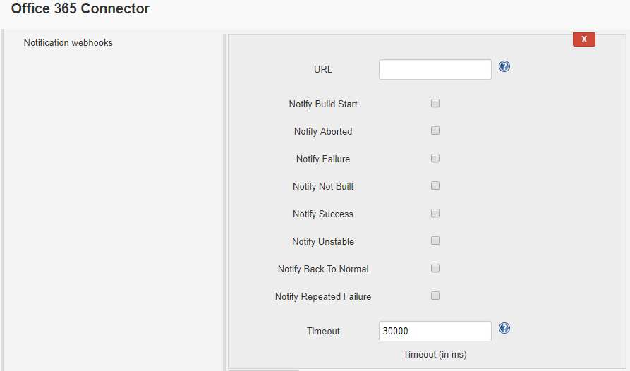
Enter URL from the Webhook URL that you have saved before, check which build states you want to be notified about and press “Save”. That’s it, and if you run your build now you’ll see notifications in your team channel.
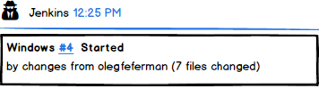
THE PROBLEM WITH BUILD START NOTIFICATIONS UX
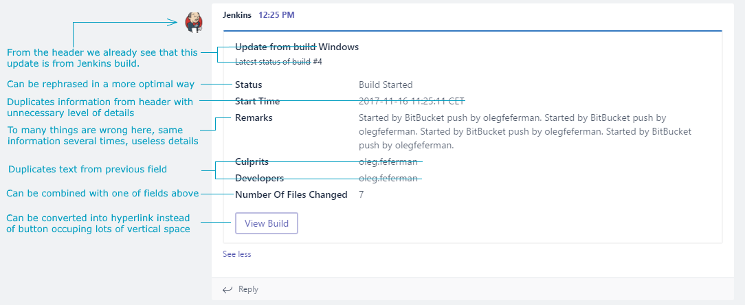
This is how your build notification will look in the Microsoft Teams channel (at least if your plugin version is 3.0 or lower).
There are few major problems here and lots to be improved.
Challenge 1: The notification occupies too much vertical space. A standard Full HD screen will be able to show only 2 notifications. In the real-life projects, you’ll have more than 1 build notifications in one channel and it is very inconvenient to see only last two of them.
Solution: notification card should occupy less vertical space. Unfortunately, this is not something you can configure in Teams. Keeping in mind that MS Teams is not an open source, the only way to get notifications in less size is to change what information is displayed on a notification card.
Challenge 2: All notifications are collapsed by default and you will need to click on “See More” to actually see information at the bottom of the card. Users don’t like making extra clicks. Nobody wants to click multiple times on the “Expand” button to see the details. Especially, If you are looking through a long list of different notifications each time.
Solution: the card needs to contain as little text as possible.
Challenge 3: Notification is too verbose, it contains too much text so:
– It is hard to find the information you’re looking for in all that noise;
– At the same time, some useful information which should be there is missing.
Many elements in this notification can be taken as the example. Let’s begin with the “Start time”. User already sees a start time at the top and it is in his timezone, nobody cares about CET not to mention seconds and date (which you can see if you hover your mouse over card’s time at the top).
Solution: useless information should be removed, duplicate information should be merged, the text that is not optimally formatted should be reformatted.
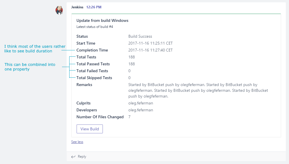
Here is our suggestion how this can be improved:
This card is much smaller but still, it contains all the information that user needs:
- Like before, you have Jenkins (so you know what kind of notification that is) and timestamp in your local time zone, so you know when an event has occurred.
- Build name. Obviously, the user needs to know what build that was.
- Build number which is also a link to a build Jenkins URL. The user needs to know build number and it would be handy to have a link in case he or she wants to open it to see more details.
- Build status. Notification should show, what has happened to the build.
- Next string starts with build reason. It is useful to know who has pushed the changes or clicked Build now button in Jenkins.
- Amount of the files that have been changed. It is not always the most important thing to know but sometimes it might be useful. Therefore, we placed it at the very end of the notification.
That’s it. If you think something useful is missing or you see more space for improvements – welcome to the comments section below.
THE PROBLEM WITH THE BUILD FINISH NOTIFICATIONS
This is what you see when your Jenkins build is finished and is posting the notifications to Teams channel.
Basically, it has the same issues as the build start notification. However, there are few extra things:
Challenge 1: Somebody may disagree (please let us know in comments why), but we think that having build duration is much more convenient than subtracting two CET timestamps. Also, you have both timestamps at the very top of the card next to Jenkins word anyway.
Solution: remove both and add build duration instead.
Challenge 2: Information about the tests takes too much space. You can calculate Total yourself If you have properties Passed, Failed, and Skipped.
Solution: regroup tests information into one line which lists different test statuses and the number of tests with this status in the current build.
Challenge 3: List of actual changes is missing. Which is bad, because It is important to see both the successful builds (for instance, QA engineers will know what to test) and the failed builds (so it is easier to spot what changes caused the build to fail).
Solution: list of changes is needed to be added alongside with the change description and the author name.
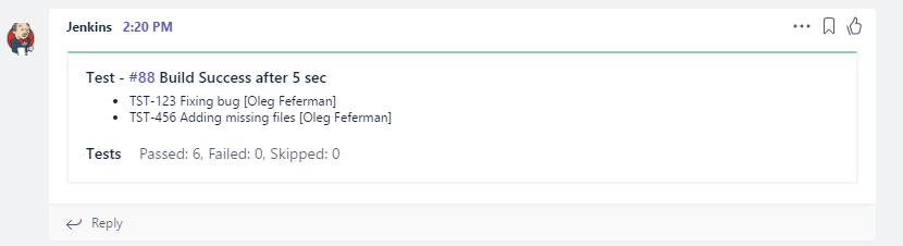
We suggest to improve it this way:
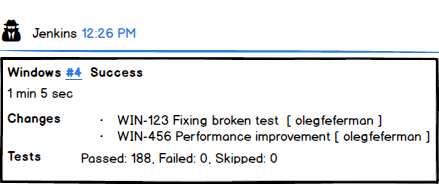
- You should be familiar with the first line because it is same as on the Start card.
- Build duration. We suggest to use it without any explanation text because its duration is clear from the format.
- List of changes with the names of the authors. It is convenient because QA engineers can quickly see what changes are in the build and who did them. Also, if the build failed – you can quickly find a way to fix it.
- Tests statistics in a single line.
The need for tests information here is arguable. For instance, if you have failed tests – the build actually should fail, so the developer will find out how many and what tests have been failed during the investigation. This can be the subject of another article. We will be happy to hear your opinions in the comments.
SOLUTION
Office 365 Connector plugin is open source so we decided to fix this issue and implemented compact notifications in our own repository, you can find the source code here. If you use it, the notifications look like this:
As you can see, during our tests we have discovered that it is more convenient for our users to have changes list directly under the header so we moved it into subheader. We needed to move build duration somewhere because of that, so we decided to move it into the header. We already see even more space for improvements and we will try to implement that in the near future. What we have achieved is that these notifications occupy less vertical space. The notifications are no longer hidden behind the “See More” link and you can browse the notifications quicker.
- Uninstall official addon version and restart Jenkins.
- Build solution yourself or download ready HPI following this link.
- On your Jenkins server go to Manage plugins\Advanced and use Upload plugin section to upload hpi file you have downloaded.
If you have any ideas and/or suggestions – feel free to contact us.